New Student Orientation Redesign | Chamberlain University
Redesigning a large-scale student orientation experience for clarity, accessibility, and consistency
I redesigned Chamberlain University’s New Student Orientation into The Student Journey: Foundations to Graduation, a cohesive digital experience supporting students across nine academic programs. The redesign transformed a large collection of essential information and resources into a more intuitive, accessible, and consistent experience, using reusable design patterns and intentional content organization to help students navigate from their first days through graduation.
Audience
New students across nine academic programs
Format
LMS-based learning experience
Tools
Canvas, DesignPLUS, HTML/CSS
My Role
Instructional Design, UX/UI Design, Development
New Student Orientation contained a large amount of essential information, tools, policies, and resources students needed as they began their programs. Over time, however, the experience had grown into a collection of individual pages and resources with inconsistent structures and limited guidance about how the pieces fit together.
The redesign needed to create a clearer path through the experience while accommodating different program requirements, supporting students beyond their first day of orientation, and establishing a structure that could be maintained as content changed.
The Challenge
Standardize for Consistency
Design Approach
Guide for Navigation
Created clear, predictable pathways that help students move through orientation and return to resources when they need them.
I created reusable layouts, navigation patterns, and visual conventions across nine programs so students encounter a predictable experience.
Design for Access
Built accessibility into the experience through clear hierarchy, readable layouts, accessible interactions, and intentional use of supported Canvas components.
Build for Scale
I used reusable DesignPLUS components and purposeful HTML/CSS to create a learning experience that can be maintained and expanded without rebuilding each page from scratch.
03
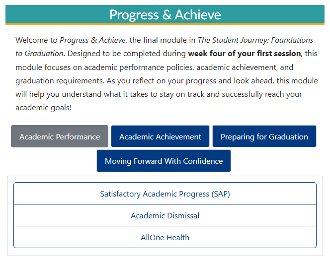
Progress & Achieve
Week Four of Classes
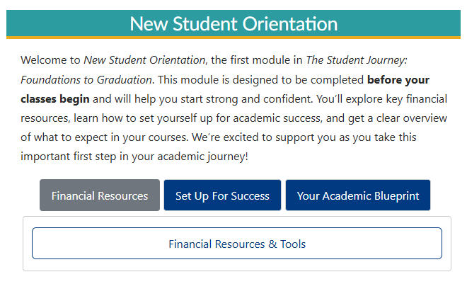
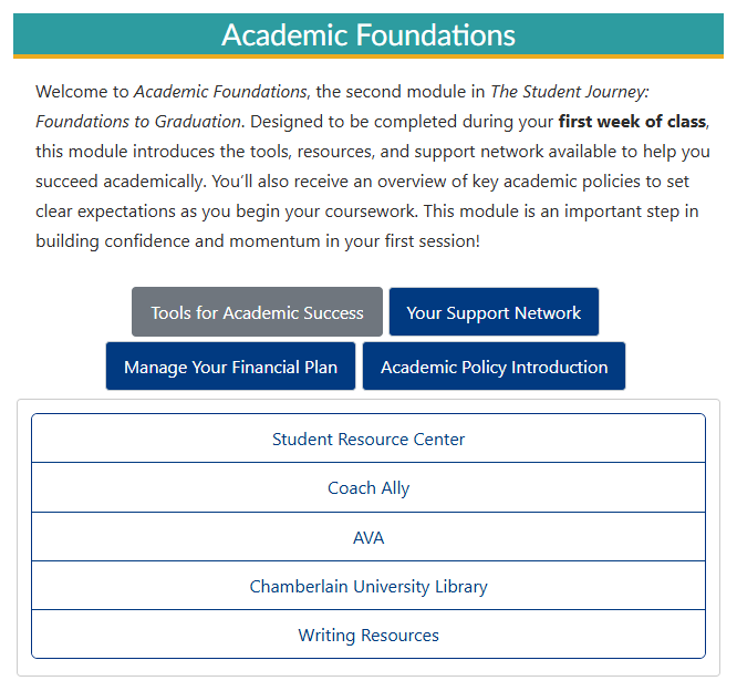
Rather than treating orientation as a collection of individual resources, I reorganized the experience into three sequential stages aligned with when students need the information: New Student Orientation before classes begin, Academic Foundations during the first week of class, and Progress & Achieve during week four of the first session.
Within each stage, related content is grouped into topic-based pathways, allowing students to focus on the information most relevant to that point in their journey while still returning directly to individual resources when they need them later.
01
New Student Orientation
Before Classes Begin
02
Academic Foundations
First Week of Class
Reorganizing Around the Student Journey
Stage → Need → Resource
Each layer narrows the student's choices, moving from where they are in their journey, to what they need help with, to the specific resource or guidance that supports that need.
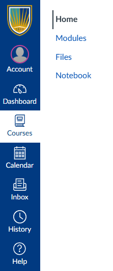
After
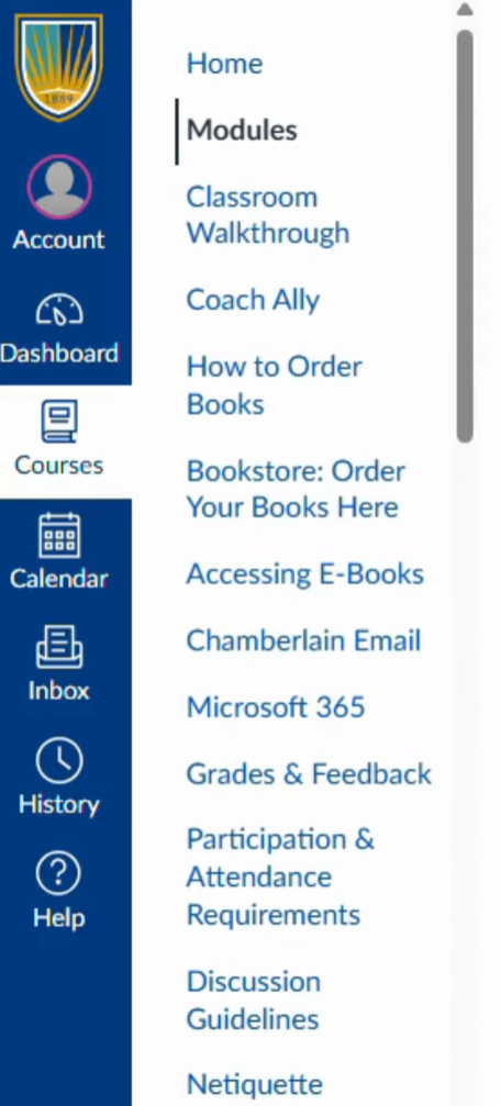
Before
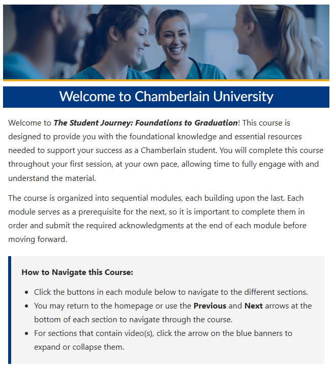
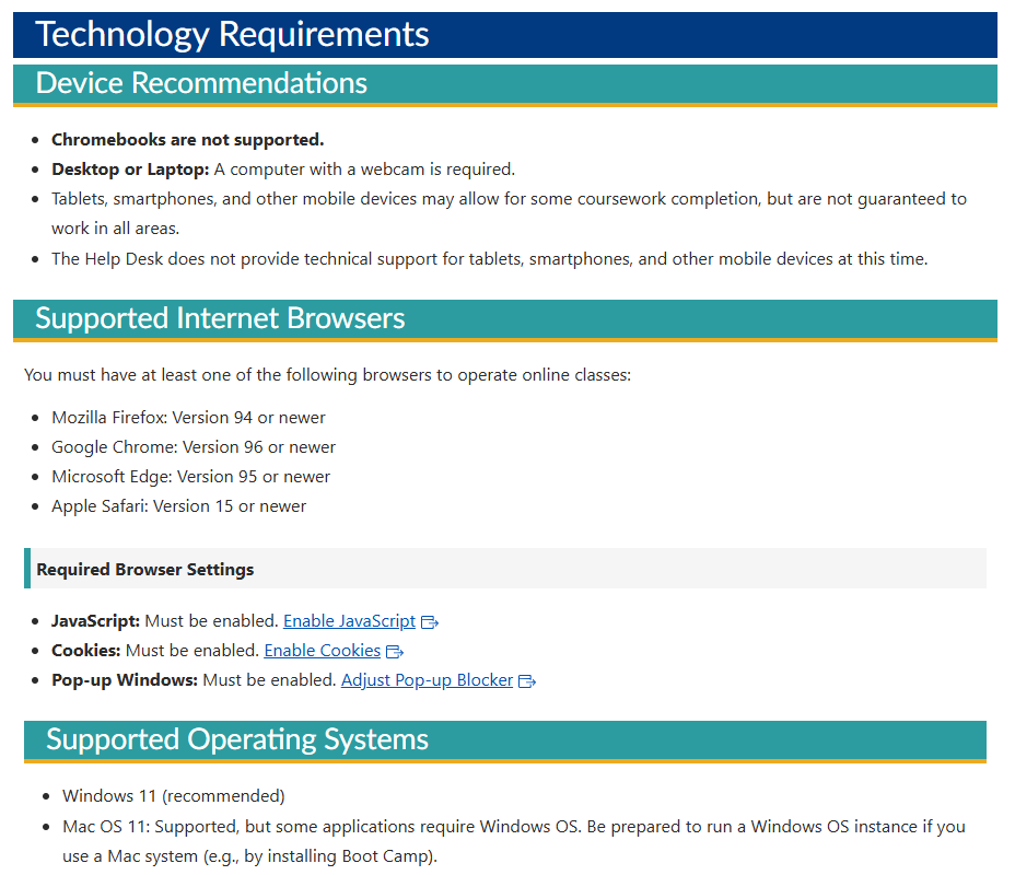
The original course exposed individual resources directly in Canvas navigation, requiring students to scan a long list—or already know the name of the resource they needed. I simplified the persistent navigation and moved resource discovery into the course itself.
Resources are now grouped by purpose within the appropriate stage and topic. Instead of asking students to determine which item in a long navigation menu might help them, the experience guides them from a broader need to the relevant support.
Making Resources Easier to Find
Resources & Quick Links
Visual Hierarchy & Callouts
With the new architecture in place, I established a shared visual and interaction language across the course. Consistent headings, navigation patterns, callouts, expandable content, and resource treatments help students recognize how content behaves from one section to the next.
Reusable patterns also allowed the experience to remain cohesive across nine academic programs while accommodating program-specific content.
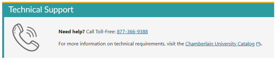
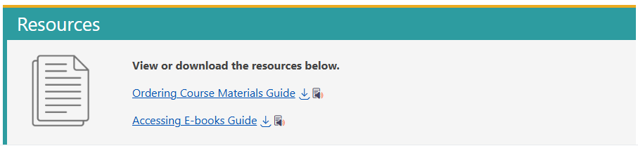
Repeated resource treatments help students recognize support, downloads, and quick-access links across the course.
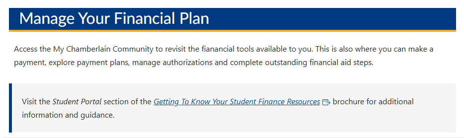
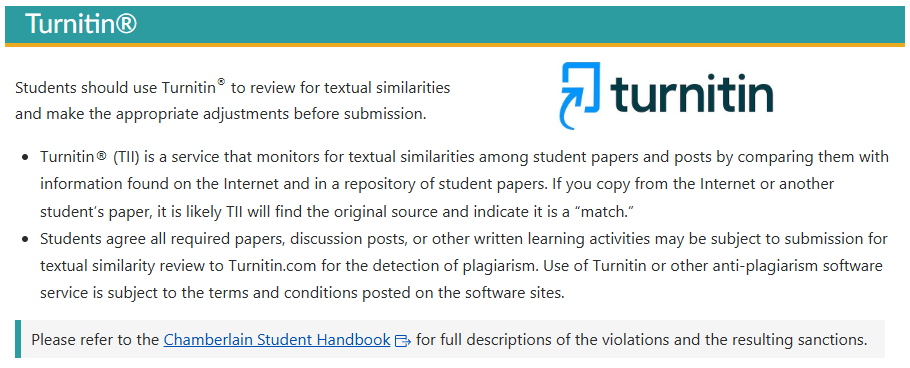
Consistent hierarchy throughout each page makes different levels and types of information easier to scan.
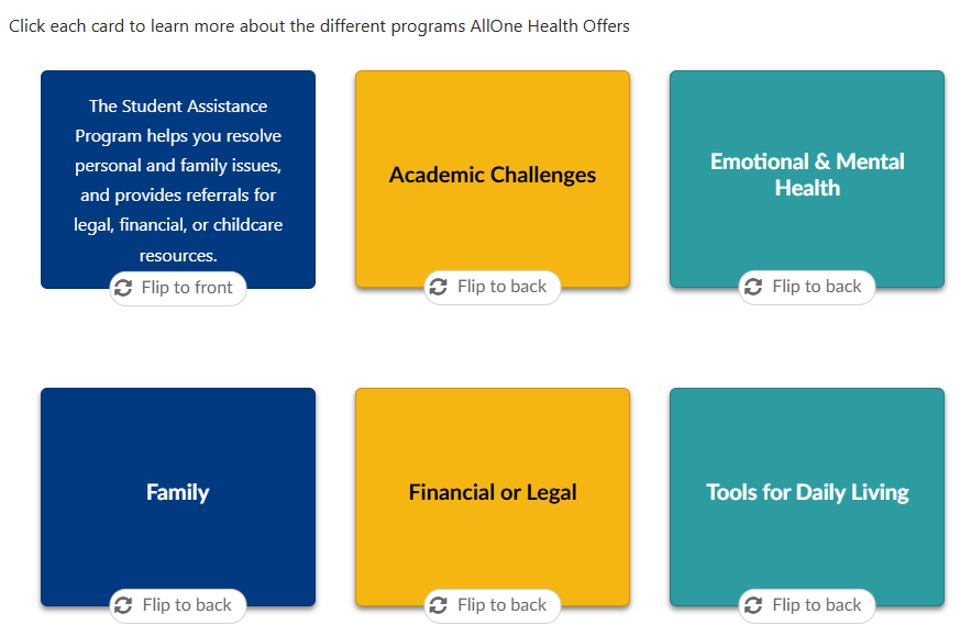
Expandable & Interactive Content
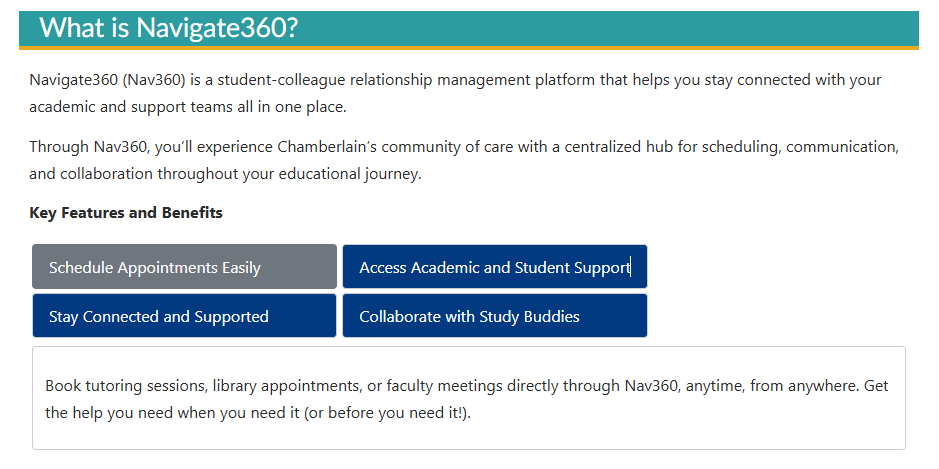
Reusable interaction patterns organize content progressively while keeping pages manageable and accessible.



Creating a Consistent Learning Experience
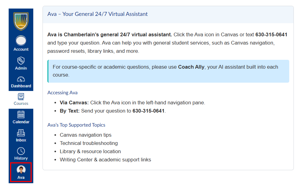
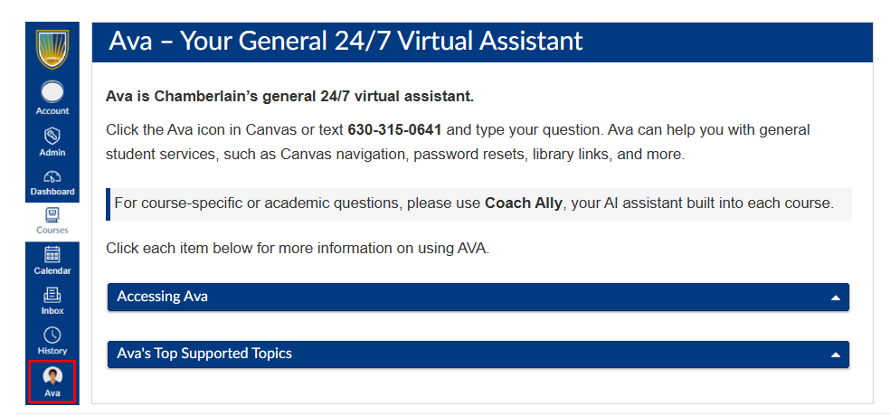
I applied progressive disclosure within individual resources as well as across the larger course architecture. In the redesigned Ava resource, students can quickly determine what the tool is and when to use it, while secondary information remains available on demand.
Classroom Walkthrough Before
Ava After
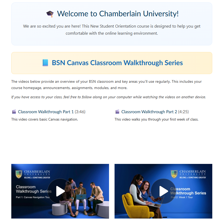
Making Media Easier to Use
Classroom Walkthrough After
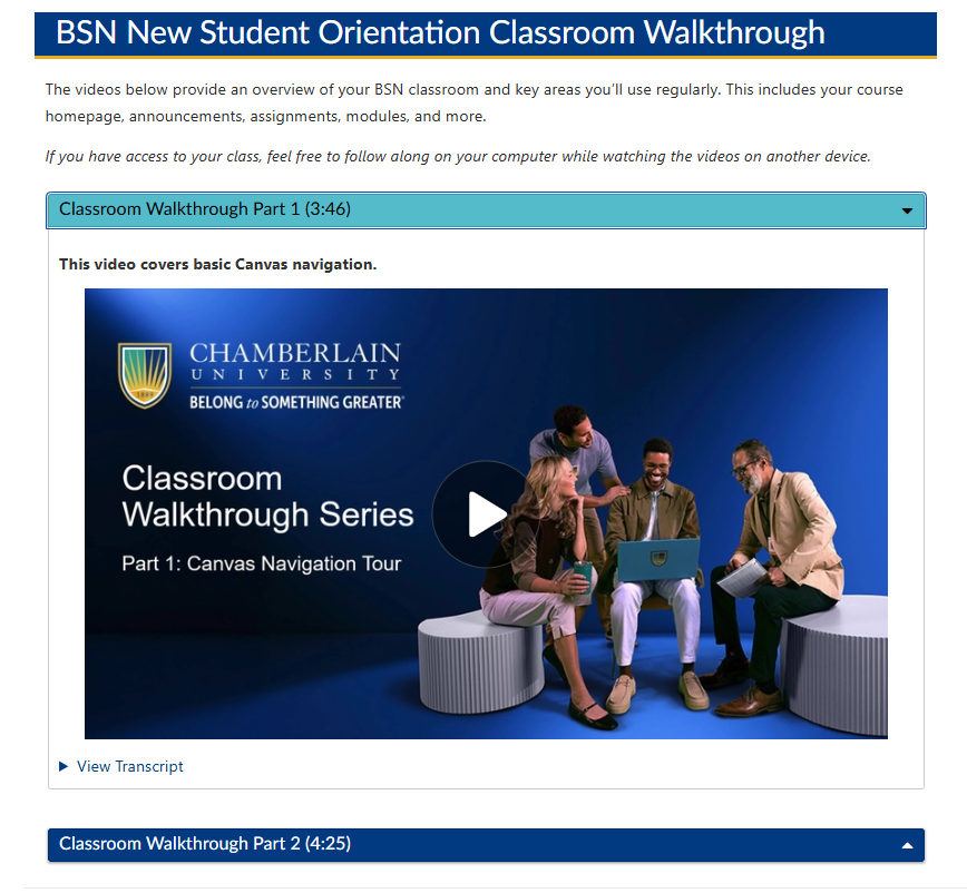
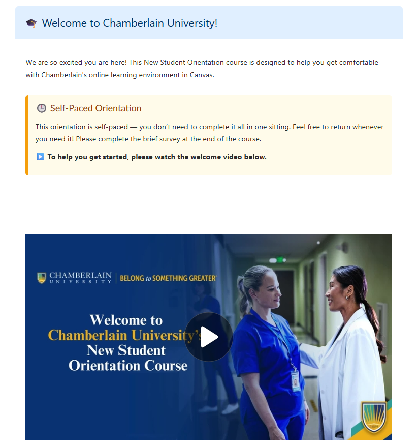
Video resources were reorganized into expandable sections that keep context, media, and transcripts together. This reduces visual clutter and page length while allowing students to focus on one resource at a time and access supporting information at the point of need.
Ava Before
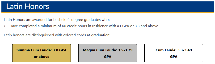
Making Information Easier to Scan
Designing for Focus and Access
Building for Scale and Maintainability
DesignPLUS + HTML/CSS
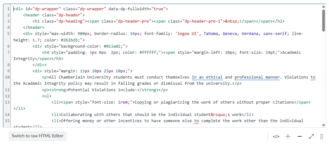
I used DesignPLUS components alongside custom HTML/CSS to extend Canvas where standard functionality could not support the intended experience. Custom development allowed me to refine layouts, navigation patterns, spacing, and content presentation while working within the technical constraints of the LMS.
I also prioritized supported, reusable components wherever possible so routine updates would not require future course editors to work directly in code.
How helpful was the course in preparing you for your program?
Measuring the Student Experience
80% - Very Confident
After completing this course, how confident do you feel about starting your program?
87% - Very Likely
How likely are you to revisit these resources during your program?
91% - Very Helpful
“I wish this was provided to me when I started my first class. This is very resourceful and would’ve helped me a lot during my lessons”
“I am a former Director of Education ... I have never witnessed an institution this intentional ever. Once you are aware of the resources available and learn how to access them, there is a elevated feeling of relief. I am grateful that I chose to complete my nursing journey. I am honored to complete this journey with Chamberlain University. Thank you for allowing me this opportunity of a lifetime. Thank you for being prepared to help your students full circle.”
*Results and comments from September 2026 survey report
The Result
The redesign transformed New Student Orientation from a collection of individual resources into The Student Journey: Foundations to Graduation—a structured experience that introduces information when students need it while remaining available as an ongoing resource.
The resulting architecture and reusable design system also created a foundation that can continue to evolve as program requirements, student needs, and institutional resources change.